Bootstrap 101 Self-Practice
Grid/Columns
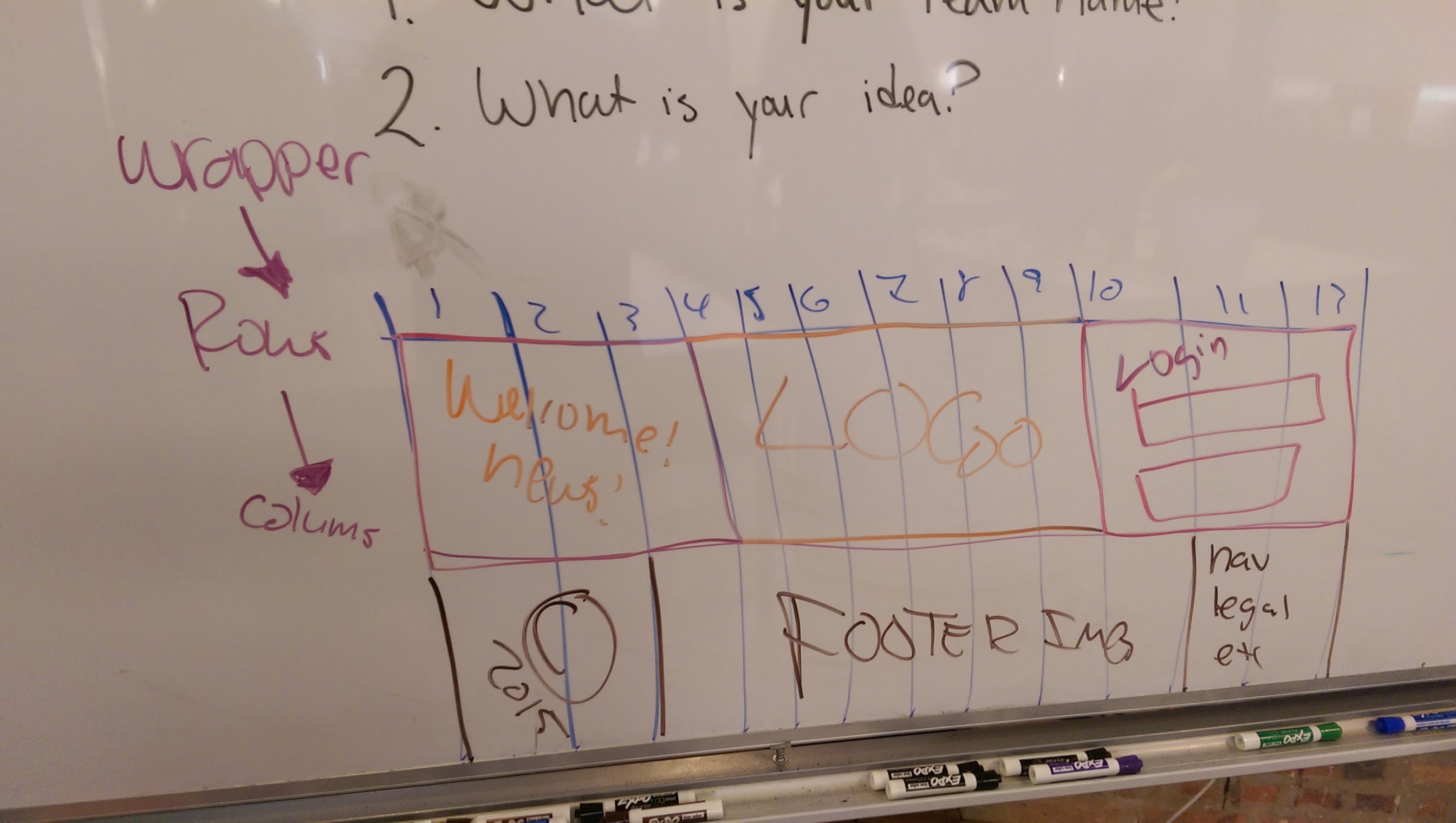
Individual Practice: Diagram
If you would like to visualize how Bootstrap works, you may do so.
- On Graph paper, create a 12 x 6 grid with a landscape orientation
- Place
header,nav,article,aside,footertags and more - Understand the class naming system of Bootstrap for columns
col-md-xwherexis a value of1through12for the grid.- 12 grids are placed inside of a row that live inside of
containers orwrappers.
Boilerplate
<section class='section'>
  <article class='row'>
    <div class='col-md-3'>3</div>
    <div class='col-md-6'>6</div>
    <div class='col-md-3'>3</div>
  </article>
</section>