Flexbox and CSS Grid Systems
Objectives
- Understand how grid systems work
- Understand layout using Flexbox
Containers, rows, and columns
Traditional CSS grids are based on the idea of containers, rows, and columns.
A container is a full width element that is as wide as the browser window.
A row sits within a container and is centered within it. A row will have a maximum and minimum width.
Most grids utilize 12 columns. The idea is that each item within a row takes up a number of column widths. All of the column elements within a row should add up to 12 in a 12 column grid.
Grid Example
.container {
  width: 100%;
}

.row {
  width: 1140px;
  margin: auto;
}

.col-1 {
  width: 95px;
  float: left;
  position: relative;
  padding: 10px;
  box-sizing: border-box;
}

/* and more grid classes here */
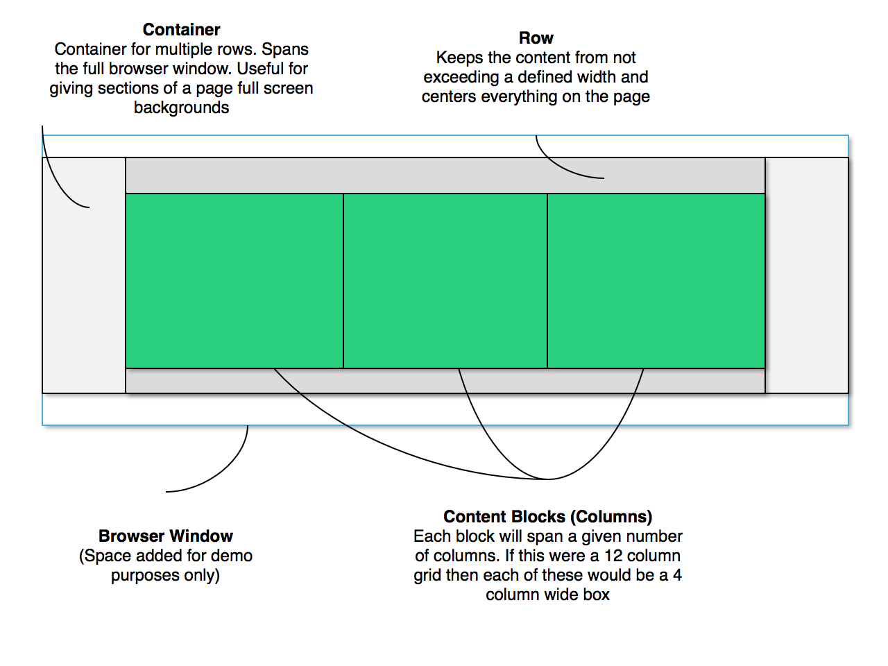 Shown Above: Grid diagram (extra padding added between container, row, and column blocks for clarity)
 Shown Above: Example of a grid system being used on an actual web page
Flexbox
Flexbox grids are easier. The idea is that you have a container and items. Each item gets automatically positioned within the container without the need for floats or percentage widths for responsive sites.
See this better guide to Flexbox than any of us could write for more